> ## Documentation Index
> Fetch the complete documentation index at: https://velt-raghul-agent-docs.mintlify.site/llms.txt
> Use this file to discover all available pages before exploring further.

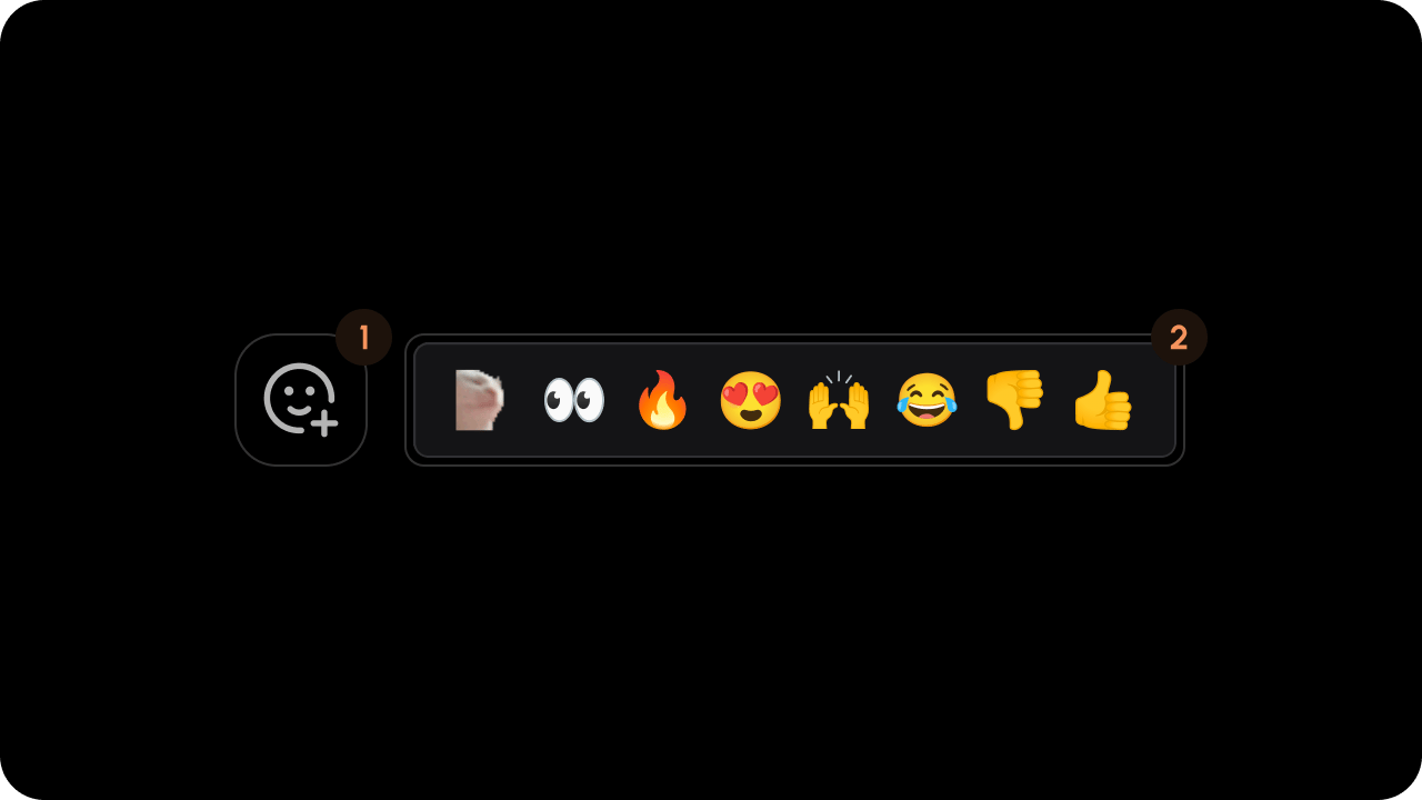
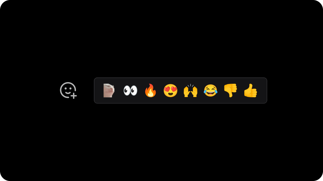
# Inline Reactions Section

> This component is used to render the reaction tool and all the reactions.

<Note>
  We recommend that you familiarize yourselves with [UI Customization Concepts](/ui-customization/overview) before attempting to modify any components.
</Note>

## VeltInlineReactionsSectionWireframe
<img src="https://mintcdn.com/velt-raghul-agent-docs/vHdpvC1890cm-3bX/images/customization/comments/inline-reactions/inline-reactions-overview.png?fit=max&auto=format&n=vHdpvC1890cm-3bX&q=85&s=0a9884ab2719fa7e85ab2062f3c5e431" alt="" width="1280" height="720" data-path="images/customization/comments/inline-reactions/inline-reactions-overview.png" />

<Tabs>
  <Tab title="React / Next.js">
    ```jsx theme={null}
    <VeltWireframe>
        <VeltInlineReactionsSectionWireframe>
            <VeltInlineReactionsSectionWireframe.Panel />
        </VeltInlineReactionsSectionWireframe>
    </VeltWireframe>
    ```
  </Tab>

  <Tab title="Other Frameworks">
    ```html theme={null}
    <velt-wireframe style="display:none;">
        <velt-inline-reactions-section-wireframe>
            <velt-inline-reactions-section-panel-wireframe></velt-inline-reactions-section-panel-wireframe>
        </velt-inline-reactions-section-wireframe>
    </velt-wireframe>
    ```
  </Tab>
</Tabs>

### Panel

<img src="https://mintcdn.com/velt-raghul-agent-docs/vHdpvC1890cm-3bX/images/customization/comments/inline-reactions/inline-reactions-overview-breakdown.png?fit=max&auto=format&n=vHdpvC1890cm-3bX&q=85&s=b0c5fa5e9b948fd187523cc8755ad5c2" alt="" width="1280" height="720" data-path="images/customization/comments/inline-reactions/inline-reactions-overview-breakdown.png" />

<Tabs>
  <Tab title="React / Next.js">
    ```jsx theme={null}
    <VeltWireframe>
        <VeltInlineReactionsSectionWireframe.Panel>
            <VeltInlineReactionsSectionWireframe.ToolContainer />
            <VeltInlineReactionsSectionWireframe.List />
        </VeltInlineReactionsSectionWireframe.Panel>
    </VeltWireframe>
    ```
  </Tab>

  <Tab title="Other Frameworks">
    ```html theme={null}
    <velt-wireframe style="display:none;">
        <velt-inline-reactions-section-panel-wireframe>
            <velt-inline-reactions-section-tool-container-wireframe></velt-inline-reactions-section-tool-container-wireframe>
            <velt-inline-reactions-section-list-wireframe></velt-inline-reactions-section-list-wireframe>
        </velt-inline-reactions-section-panel-wireframe>
    </velt-wireframe>
    ```
  </Tab>
</Tabs>

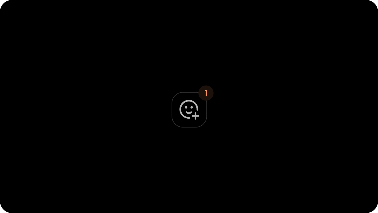
#### ToolContainer

<img src="https://mintcdn.com/velt-raghul-agent-docs/vHdpvC1890cm-3bX/images/customization/comments/inline-reactions/inline-reactions-tool-container.png?fit=max&auto=format&n=vHdpvC1890cm-3bX&q=85&s=4f6ea5533a870f06977b1f11c27abd8e" alt="" width="1280" height="720" data-path="images/customization/comments/inline-reactions/inline-reactions-tool-container.png" />

<Tabs>
  <Tab title="React / Next.js">
    ```jsx theme={null}
    <VeltWireframe>
        <VeltInlineReactionsSectionWireframe.ToolContainer>
            <VeltReactionToolWireframe />
        </VeltInlineReactionsSectionWireframe.ToolContainer>
    </VeltWireframe>
    ```
  </Tab>

  <Tab title="Other Frameworks">
    ```html theme={null}
    <velt-wireframe style="display:none;">
        <velt-inline-reactions-section-tool-container-wireframe>
            <velt-reaction-tool-wireframe></velt-reaction-tool-wireframe>
        </velt-inline-reactions-section-tool-container-wireframe>
    </velt-wireframe>
    ```
  </Tab>
</Tabs>

##### VeltReactionToolWireframe

<Tabs>
  <Tab title="React / Next.js">
    ```jsx theme={null}
    <VeltWireframe>
        <VeltReactionToolWireframe />
    </VeltWireframe>
    ```
  </Tab>

  <Tab title="Other Frameworks">
    ```html theme={null}
    <velt-wireframe style="display:none;">
        <velt-reaction-tool-wireframe></velt-reaction-tool-wireframe>
    </velt-wireframe>
    ```
  </Tab>
</Tabs>

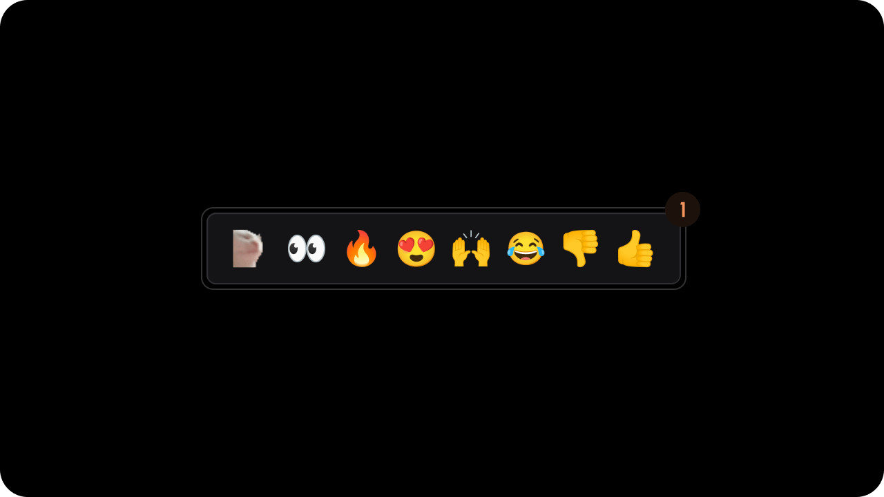
#### List

<img src="https://mintcdn.com/velt-raghul-agent-docs/vHdpvC1890cm-3bX/images/customization/comments/inline-reactions/inline-reactions-list.png?fit=max&auto=format&n=vHdpvC1890cm-3bX&q=85&s=9dacf00f11486322ed90a062c70e9ef8" alt="" width="1280" height="720" data-path="images/customization/comments/inline-reactions/inline-reactions-list.png" />

<Tabs>
  <Tab title="React / Next.js">
    ```jsx theme={null}
    <VeltWireframe>
        <VeltInlineReactionsSectionWireframe.List>
            <VeltReactionPinWireframe />
        </VeltInlineReactionsSectionWireframe.List>
    </VeltWireframe>
    ```
  </Tab>

  <Tab title="Other Frameworks">
    ```html theme={null}
    <velt-wireframe style="display:none;">
        <velt-inline-reactions-section-list-wireframe>
            <velt-reaction-pin-wireframe></velt-reaction-pin-wireframe>
        </velt-inline-reactions-section-list-wireframe>
    </velt-wireframe>
    ```
  </Tab>
</Tabs>

##### VeltReactionPinWireframe

<Tabs>
  <Tab title="React / Next.js">
    ```jsx theme={null}
    <VeltWireframe>
        <VeltReactionPinWireframe />
    </VeltWireframe>
    ```
  </Tab>

  <Tab title="Other Frameworks">
    ```html theme={null}
    <velt-wireframe style="display:none;">
        <velt-reaction-pin-wireframe></velt-reaction-pin-wireframe>
    </velt-wireframe>
    ```
  </Tab>
</Tabs>

## Styling

### Disable ShadowDOM

* By default, ShadowDOM is used to ensure that your app's CSS does not interfere with the styling of the SDK components.
* Disable the shadow dom to apply your custom CSS to the component.

Default: `true`

<Tabs>
  <Tab title="React / Next.js">
    ```jsx theme={null}
    <VeltInlineReactionsSection shadowDom={false} />
    ```
  </Tab>

  <Tab title="Other Frameworks">
    ```jsx theme={null}
    <velt-inline-reactions-section shadow-dom="false"></velt-inline-reactions-section>
    ```
  </Tab>
</Tabs>

### Dark Mode

Default: `false`

<Tabs>
  <Tab title="React / Next.js">
    **Using Props:**

    ```js theme={null}
    <VeltInlineReactionsSection darkMode={true} />
    ```

    **Using API:**

    ```js theme={null}
    const reactionElement = client.getReactionElement();
    reactionElement.enableDarkMode();
    reactionElement.disableDarkMode();
    ```
  </Tab>

  <Tab title="Other Frameworks">
    **Using Props:**

    ```html theme={null}
    <velt-inline-reactions-section dark-mode="true"></velt-inline-reactions-section>
    ```

    **Using API:**

    ```js theme={null}
    const reactionElement = Velt.getReactionElement();
    reactionElement.enableDarkMode();
    reactionElement.disableDarkMode();
    ```
  </Tab>
</Tabs>

## Variants

### Pre-defined Variants

The Inline Reactions has 1 pre-defined variant:

* `inline`: This will customize the default components inside the Inline Reactions Component.

You can define your own variants and use them in different places of your app.

<Tabs>
  <Tab title="React / Next.js">
    ```jsx theme={null}
     <VeltWireframe>
        <VeltInlineReactionsSection variant="inline"></VeltInlineReactionsSection>
    </VeltWireframe>
    ```
  </Tab>

  <Tab title="Other Frameworks">
    ```html theme={null}
    <velt-wireframe style="display:none;">
        <velt-inline-reactions-section variant="inline"></velt-inline-reactions-section>
    </velt-wireframe>
    ```
  </Tab>
</Tabs>